HTML, CSS/CSS Preprocessors
[Sass] 조건문 이용하여 반응형 웹 만들기
zenghyun
2023. 1. 15. 15:58
조건문을 이용하여 반응형 웹을 만들어보자
[ _responsive.scss ]
@mixin responsive($device){
@if $device == "maxDesktop" {
  @media screen and (min-width: 1024px){
    @content;
  }
} @else if $device == "minDesktop" {
      @media screen and (min-width: 768px) and (max-width: 1023px){
        @content;
      }
  } @else if $device == "tablet" {
    @media screen and (min-width: 480px) and (max-width: 767px){
      @content;
    }
  } @else if $device == "phone" {
    @media screen and  (max-width: 479px){
      @content;
    }
  }
}
mixin을 이용하여 responsive를 만들고 인자를 받을 수 있게 만들었다.
조건문을 이용하여 인자로 받은 $device의 문자열이 무엇을 나타내는지에 따라 미디어쿼리의 규격을 다르게 하였다.
※ 디바이스 별 해당도 규격
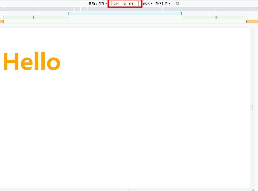
- 높은 해상도의 desktop : 1024px 이상
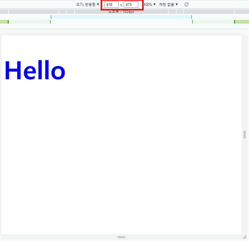
- 낮은 해상도의 desktop : 768px ~ 1023px
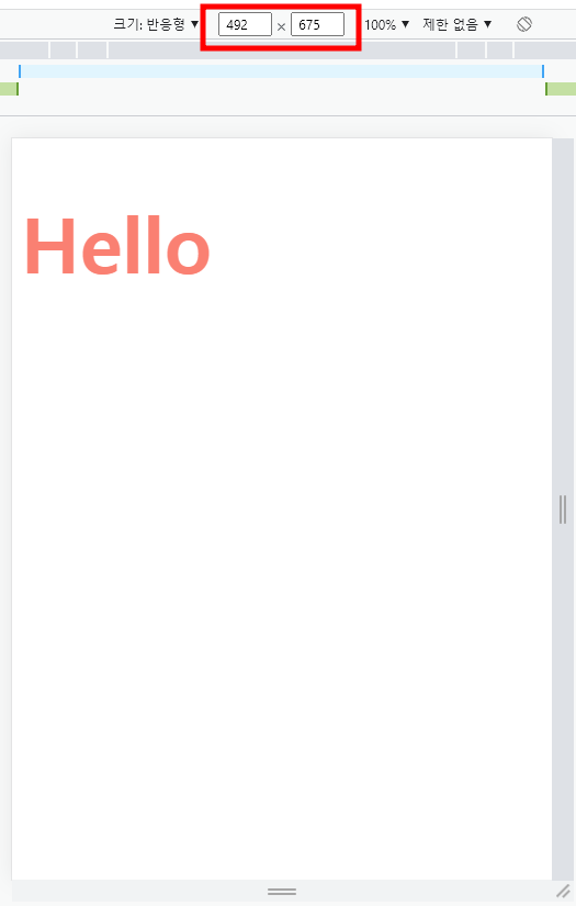
- tablet: 480px ~ 767px
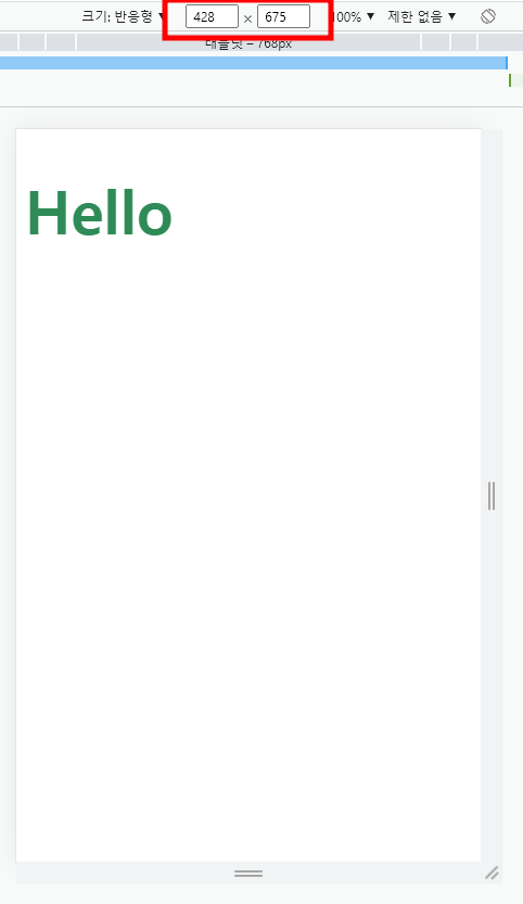
- phone: 479px 이하
[ main.scss ]
@import "_responsive";

h1{
  @include responsive("maxDesktop"){
    font-size: 100px;
    color: orange;
  }
  @include responsive("minDesktop"){
    font-size: 85px;
    color: blue;
  }
  @include responsive("tablet"){
    font-size: 70px;
    color:salmon
  }
  @include responsive("phone"){
    font-size: 55px;
    color: seagreen;
  }
}
_responsive.scss를 import 하고 인자 값이 달라질 때마다 font-size를 15px 씩 감소하고 글자 색을 변경하였다.
1024px 이상일 때
768px 이상 1023 px 이하일 때
480px 이상 767px 이하일 때
479px 이하일 때